March 31, 2026
Fix These 5 Tableau Dashboard Mistakes Today

These 5 Tableau dashboard mistakes can make your work look cluttered, confusing, and beginner-level fast. In this video, I break down the 5 biggest mistakes new Tableau users make and show you how to fix them so your dashboards look cleaner, more professional, and easier to use.
Download the practice workbook from this video here.
If you’re learning Tableau dashboard design, this video will help you avoid common problems like misusing colors, adding too many charts, ignoring your audience, overcomplicating layouts, and forgetting interactivity. These simple dashboard design tips will help you build cleaner, more actionable dashboards that feel less like data dumps and more like real business tools.
What we’ll cover:
- Misusing Colors, avoid the “Skittles Effect” and highlight what matters
- Chart Overload, use the Rule of 4 for cleaner dashboards
- Ignoring Your Audience, build for stakeholder decisions, not personal preference
- Container Chaos, why simple layouts beat overbuilt designs
- Functionality Fails, improve filter actions and remove distracting defaults
March 9, 2026
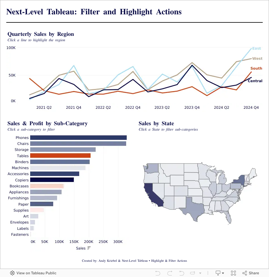
Highlight vs Filter Actions in Tableau: When Should You Use Each?

Highlight vs Filter Actions in Tableau can completely change how users interact with your dashboards. In this tutorial, you’ll learn the difference between highlight actions and filter actions, when to use each one, and how to build both into a Tableau dashboard from start to finish.
Using a practical end-to-end example, we’ll create charts, assemble them into a dashboard, and add interactive actions that improve usability and analysis. By the end, you’ll understand how highlight actions guide attention, how filter actions change the view, and how to use both together to create more effective Tableau dashboards.
Whether you’re new to Tableau dashboard actions or looking to sharpen your skills, this walkthrough will help you build more interactive and user-friendly dashboards with confidence.
February 25, 2026
How to Build a Quadrant Chart in Tableau | Step-by-Step Tutorial

In this lesson, I walk through how to build a quadrant chart (4-quadrant scatterplot) in Tableau.
Quadrant charts are one of the most effective ways to compare performance across two measures and quickly identify outliers, opportunities, and risk areas.
In this example, we’re analyzing:
- Profit Ratio
- Average Discount
At first glance, a scatterplot shows the relationship.
But once you add quadrant segmentation, the insight becomes much clearer.
You can instantly see:
- High profit / Low discount performers
- High profit but heavily discounted items
- Low profit / Low discount products
- Low profit / High discount problem areas
Inside the video, I’ll walk you through:
- Creating a Profit Ratio calculation
- Building the base scatterplot
- Adding average reference lines
- Splitting the view into four quadrants
- Categorizing marks based on performance
- Two different ways to build the quadrant chart
This is a foundational analysis technique you can apply to product performance, customer segments, sales teams, marketing channels, and more.
Download the Workbook + Dataset
You can download the workbook and dataset used in this lesson here:
👉 https://nlt.kit.com/quadrant
If you want to go deeper than individual chart techniques, this is exactly the kind of real-world training we focus on inside Next-Level Tableau.
Live classes.
Real use cases.
Advanced techniques you can apply immediately.
Learn more here:
👉 https://www.nextleveltableau.com/
February 18, 2026
How to Use Split, Custom Split, and Replace in Tableau

October 21, 2025
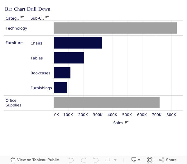
How to Drill Down in Tableau Using Set Actions (Bar Chart Tutorial)

Unlock Powerful Tableau Drill Downs With Set Actions 🔍
If you’re still clicking around dashboards trying to “fake” a drill down — stop! In this video, I’ll walk you step-by-step through how to use Set Actions in Tableau to build a fully interactive bar chart drill down.
👉 Start here to level up faster:
Tableau Starter Kit → https://www.nextleveltableau.com/starterkit
Core Concepts Course → https://www.nextleveltableau.com/tcc
Next-Level Tableau → https://www.nextleveltableau.com/
I’ve helped thousands of Tableau analysts move from frustration to clarity using features like this — and once you master Set Actions, your dashboards will finally work like your users expect them to.
📌 If you’re ready to stop confusing your users and start building cleaner, smarter dashboards… you’re in the right place.
See how it all works below the video.
October 13, 2025
Proportional Brushing in Tableau with Set Actions

In this video, you'll learn how to use Proportional Brushing in Tableau to show contribution without filtering your data.
Most dashboards rely on filters. But sometimes your users need context, not isolation. In this tutorial, I’ll walk you step by step through how to build a proportional brushing interaction using Set Actions in Tableau.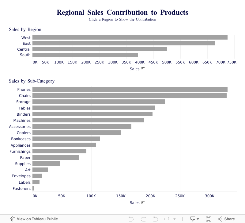
September 17, 2025
Tableau Donut Chart with Map Layers (Step-by-Step)

Master Tableau Donut Charts with Map Layers in Minutes!
In this tutorial, I’ll show you exactly how to create the perfect donut chart in Tableau using map layers—step by step. 👉 Ready to go deeper? Explore my Tableau courses here: https://www.nextleveltableau.com Whether you’re just starting out or already an experienced Tableau developer, this walkthrough will help you create clean, professional donut charts that impress clients and stakeholders. Download the workbook at the bottom 👇Check out my other Tableau tutorials: 🎥 Make an AWESOME Tableau Dashboard in Only 10 Minutes 🎥 Create a Perfect Waffle Chart Using Map Layers ----------

August 14, 2025
How to Clean Messy Data in Tableau in Seconds!

In this tutorial, I’ll show you how to use Tableau’s Data Interpreter to clean up a messy dataset in seconds. You’ll learn how to automatically remove unnecessary headers, fix field names, and get your data ready for analysis.
Then, we’ll take that cleaned data and build a Population Pyramid from scratch — perfect for visualizing demographic distributions like age and gender.
You’ll learn:
• How Tableau’s Data Interpreter works and when to use it
• Tips for cleaning data quickly without leaving Tableau
• Step-by-step instructions to create a Population Pyramid
• How to make your visualization clear and easy to read
Whether you’re a beginner or an experienced Tableau user, this video will help you save time, clean your data, and create a chart that impresses stakeholders.
📚 RESOURCES
Data (from ONS)
📩 NEWSLETTER
Each week, I'll send you Tableau tips, tutorials, and strategies to design better dashboards, have more impactful, and stand out in your career: https://nlt.kit.com/
📖 LEARN FROM ME
Want to get better at Tableau?
Pick the path that fits your level:
Join Next-Level Tableau: Advanced training, live sessions, expert support → https://www.nextleveltableau.com/ Already know the basics?
Get the Core Concepts course and sharpen your skills fast. → https://www.nextleveltableau.com/tcc Just getting started?
Try the Starter Kit: A simple intro to Tableau with zero fluff. → https://www.nextleveltableau.com/starterkit
August 6, 2025
Tableau Tutorial for Beginners (2025)

Want to learn Tableau fast?
Start with this beginner-friendly tutorial where I'll show you how to import data, clean it, build your first interactive dashboard, and share your dashboard—all using Tableau Desktop.
📚 RESOURCES• 📂 Sample Excel file to follow along (thanks Kevin Stratvert)
• 📊 Workbook 📺 RELATED VIDEOS
• Mastering Containers
• 370 FREE Tableau Tutorials 📩 NEWSLETTER
Each week, I'll send you Tableau tips, tutorials, and strategies to design better dashboards, have more impactful, and stand out in your career: https://nlt.kit.com/ 🔽 CONNECT WITH ME
• Official website
July 31, 2025
How to Create Hexbin Scatterplots in Tableau

Want to get better at Tableau?
July 24, 2025
How to Add Two Values to One Parameter in Tableau

March 19, 2025
How to Analyze Customer Retention with a Jump Plot

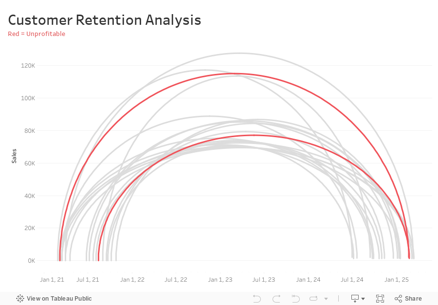
-
Connect sales data source to 180 points and relate “1” to “1”
-
Compute Min Date by customer
{ FIXED [Customer Name] : MIN([Purchase Date]) } -
Compute the Max Date by Customer
{ FIXED [Customer Name] : MAX([Purchase Date]) } -
Filter customers that made more than one order (Max Date > Min Date)
[Max Date]>[Min Date] -
Create Customer Length calc
DATEDIFF('day',[Min Date],[Max Date]) -
Create Columns calc (continuous dimension)
DATE( ((COS([Point] * PI() / 180)) + 1 ) * (FLOAT([Max Date])-FLOAT([Min Date])) / 2 + FLOAT([Min Date]) ) -
Create Rows calc (continuous dimension)
SIN((MIN([Point])) * PI() / 180) * SUM([Sales]) -
Add Columns and Rows to viz
-
Add Customer to Detail
-
Add Path to Path
-
Create Profitable calc and add to Color
{ FIXED [Customer Name] : SUM([Profit])}>0
February 20, 2025
How to Create a Multi Column Dot Plot

February 12, 2025
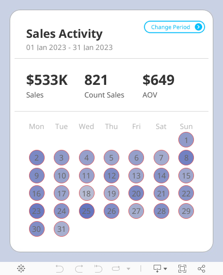
Advanced Calendar Heat Maps in Tableau (No More Workarounds!)

February 4, 2025
How to Exclude Reference Lines from Grand Totals in Tableau

Ever added a reference line to your Tableau visualization, only to see it appear in the grand total row, even when it doesn’t make sense?
If your grand total uses a different aggregation than your main data (e.g., SUM vs. AVG), the reference line can be misleading.
Unfortunately, Tableau doesn’t offer a simple way to exclude it—but there’s a trick to removing it while keeping your totals visible.
In the video below, I’ll walk you through the step-by-step solution to remove reference lines from grand totals.
Want to become an advanced Tableau user?
Unlock your full potential with Next-Level Tableau, the ultimate training program for Tableau users. Gain access to expert-led tutorials, live sessions, and a supportive community designed to help you master advanced skills, create stunning dashboards, and achieve your career goals.
Learn more and take your Tableau skills to the next level today at nextleveltableau.com.
Unsure? Sign up for my free course at starter.nextleveltableau.com.
January 22, 2025
L-Shaped Bars: The Chart You Didn't Know You Needed

December 20, 2024
Create a Custom Calendar Widget

Thanks Nicholas for providing me with the data set and setting an example of how simple visualization can communicate data effectively.
If you're not already following Nicholas, do so. You're guaranteed to find inspirational designs for your dashboards.
No extensions required. I think you'll love the trick I did with the title so that you can't click on it.
Downloading the workbook so that you can reverse engineer it is one of the best ways to learn.
December 17, 2024

Learn how to build a stunning waffle chart in Tableau using map layers and calculations!
This advanced Tableau tutorial will show you how to simplify the creation of waffle charts while unlocking powerful design and flexibility for your data analysis projects.
You’ll Learn How To:
- Connect Tableau to Superstore and a waffle chart template with Relationships
- Use the MakePoint function to create dynamic map-based charts
- Apply map layers for advanced customization and perfect label placement
Why You Need This:
This method combines advanced Tableau charts with the flexibility of map layers, allowing you to:
1. Create precise grid-based waffle charts.
2. Perfectly center labels without complex workarounds.
Who Is This For?
- Data analysts looking to enhance their Tableau dashboards
- Advanced Tableau users exploring new chart techniques
Become a Next-Level Tableau member and become a Tableau expert

November 25, 2024
Perfect Labels For Rounded Bar Charts In Under 2 Minutes

Labeling a rounded bar has always been tricky. You might manually drag the labels, try to play around with the alignment and more, but still, you can't get the labels perfect.
No more! In this Tableau Tip, I'll show you:
1. Why standard labels don't work
2. How to build a rounded bar chart
3. How to perfectly align the labels
September 26, 2024
Stop Chart Disasters NOW With This Crucial Method


